
5 keys to a successful reporting dashboard
What is a reporting dashboard?
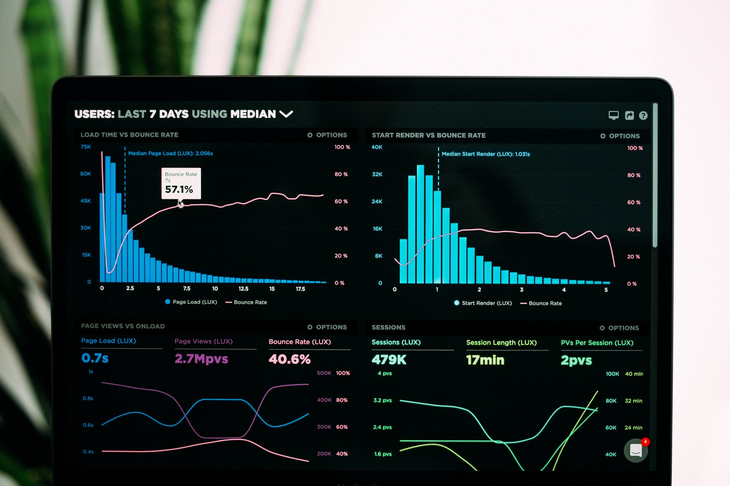
A dashboard is a management tool that is used to help visualize, track, analyze, and display key performance indicators (KPIs) to monitor the strength and health of a campaign. Dashboards provide a comprehensive snapshot of large datasets in order to identify past trends that will help create deeper insights and influence future decision making. The most successful dashboards are customizable to meet the needs of a particular business or company. Visually, dashboards typically provide a combination of charts and graphs to help conceptualize large datasets in a format that is easier to digest.
Creating a reporting dashboard
Dashboards can be created using a number of visualization tools (think Tableau, Data Studio, or Domo). While the specific tool selected may vary on business need, the end outcome is the same: by using a tool like this to build a dashboard, marketers are able to combine data from multiple sources and gain insight into performance by exploring various combinations of dimensions (campaign, platform, or location) and metrics (quantitative measurements like clicks, spend, and conversions). The length or depth of a dashboard can vary based on what a brand cares about most. But, as long as a dashboard enables viewers to understand the overall health and effectiveness of a campaign or KPIs, the dashboard will be successful.
What characteristics make up a good dashboard?
1) Customizable — A key component to a successful dashboard is its ability to adapt and change, just as a business does. A dashboard cannot be so concrete that it’s unable to change alongside the dataset that it’s visualizing. The most successful dashboards find a balance between being tailormade for their specific purpose and the ability to update as necessary. For example, if the dashboard template were to be repurposed for another business unit or report, it should be flexible enough to inject different types of data sets and accurately display them.
For a practical application: if the data set is for an appliance company and includes data on both sinks and dishwashers, a dashboard needs the flexibility to report on each appliance individually and collectively. This makes it possible to compare and contrast KPIs against one another to isolate the data and have a stronger understanding of each business unit as its own singular item.
2) Balance — A strong dashboard must find the perfect balance of what data to display, and how best to display it. It finds a mix between displaying granular datasets alongside charts and graphs to more accurately portray the dataset on hand. For example, having the ability to report on the minute details of a data base is critical from a flexibility standpoint, but as a metric gets more specific, the smaller the story becomes when crafting insights. An example of a granular insight that fails to tell the full story would be something like, “70% of traffic came from desktop users in December.” Instead, use the granularity as an accessory to the larger insight, such as:
- “Traffic increased by 40% month over month due to a spike in paid search data”
- “We noticed that that paid search traffic was largely made up of desktop users, which accounted for 85% of paid search traffic, and 70% of total traffic in December”
- “We are expecting desktop traffic to continue to provide high engagement rates, as less users are using mobile devices and are not on-the-go during the pandemic”
Often, dashboards project far too much data at this granular level, and it loses its ability to tell a story within the data. It’s crucial to have the correct balance of visuals and raw numbers to convey the story needing to be told. The best dashboards will provide a snapshot of the overall health of a business, but still be customizable enough to report data of a more granular nature if need be.
3) Ease of comprehension — Creating a dashboard that is both detailed but easy to comprehend is no small order. Finding the perfect balance of flexibility, while also being user friendly, is crucial. A dashboard should be able to reflect the overall health of a business in a clear and concise manner, allowing for any reader (even those with little to no background on the subject) to tell the story that the dashboard is trying to convey. For example, the opening page of a dashboard should focus solely on the overall trends of the primary KPIs in a simple and easily digestible format. The subsequent pages can increasingly get more specific, but it is critical for the dashboard to open its report in a clean, simplistic way to provide the reader an upfront understanding of the details to follow.
4) Visually appealing — Dashboards must be visually appealing to the readers and easily comprehendible in order to tell the story in the most impactful way. The dashboard should catch the eye of the reader and draw them into the data. This requires a careful, often color coordinated blend of visuals and text to easily identify trends and tendencies of the data along a particular timeframe. Dashboards should not be a dull blend of numbers and text boxes, but utilize a creative and informative flair that provides the best experience for the reader.
5) Ability to evolve — As your business grows, your ability to report should as well. In the age of digital marketing, possessing the ability to virtually display the health and wellness of your business is critical. Dashboards allow users to identify trends and make pivots/decisions accordingly to capitalize on opportunities. Dashboards are ever-evolving, and although we have just scratched the surface of the capabilities of data visualization tools available, dashboards have allowed marketers and businesses a unique opportunity to explore areas of their business that were previously untapped. As digital reporting continues to grow, so will our opportunities to create and improve within the data realm. The most successful dashboards are those that can evolve and grow alongside a business and can update to reflect new business decisions.
Why does having a strong dashboard matter?
At the end of the day, having data that can help you make informed decisions is priceless. Here are three key benefits of a well-created dashboard:
- A dashboard that’s set up correctly — one that can provide visibility and transparency across your organization in near real time — will increase efficiency and help to inform business objectives.
- A strong dashboard can act as an insurance policy. It’s common to look at a dashboard — specifically at a snapshot view — and not see obvious confirmation that media is working as expected. In these instances, dashboards are crucial because they make it possible to manipulate certain dimensions and metrics to get a deeper look. This underscores why there is such an emphasis on balancing particular metric highlights and broader visualizations within dashboards — as the granularity increases, a new story begins to unravel that exposes new information and insights.
- A great dashboard should lead to more questions. As familiarity with the dashboard grows, readers will become more confident asking bigger or more complex questions (“why do conversion rates differ so greatly from one another if they are all form fills?”, “could our dollars be better spent on X platform because I can see that our conversion rate and engagement is much stronger?”). And this is a good thing, because its questions like these — and the work required to answer them — that push campaigns into new territory.
Image Source: Unsplash